

Yelp iOS Application Redesign
How Might We Empower YELP Customers to better utilize search categories and filters?
Context
This project is an exercise to demonstrate my design process when redesigning an existing user experience. I chose to analyze and redesign the current categories and filters for the popular crowd-sourced review app Yelp. My focus was two-fold, to increase engagement with a more visual UI and to encourage users to explore more of the existing browse categories.
A New Taxonomy of Categories
The existing search categories page is a monolith of listed options, with many categories buried under a "more categories" link. I've parsed out this list into a framework of three use-based categories.
-
Large images and hit-area for the most common categories.
-
New “Services” section that combines delivery and reservation options.
-
New “Your Categories” section that highlights recent searches and user-saved categories.
process methods
-
Audit of existing categories & filter experience/workflow.
-
Created new taxonomy of categories supported in a UI redesign with visually parsed use-based sections.
-
Diagramed new workflows for each section in the new taxonomy.
-
Sketched new UI to help increase user engagement.
-
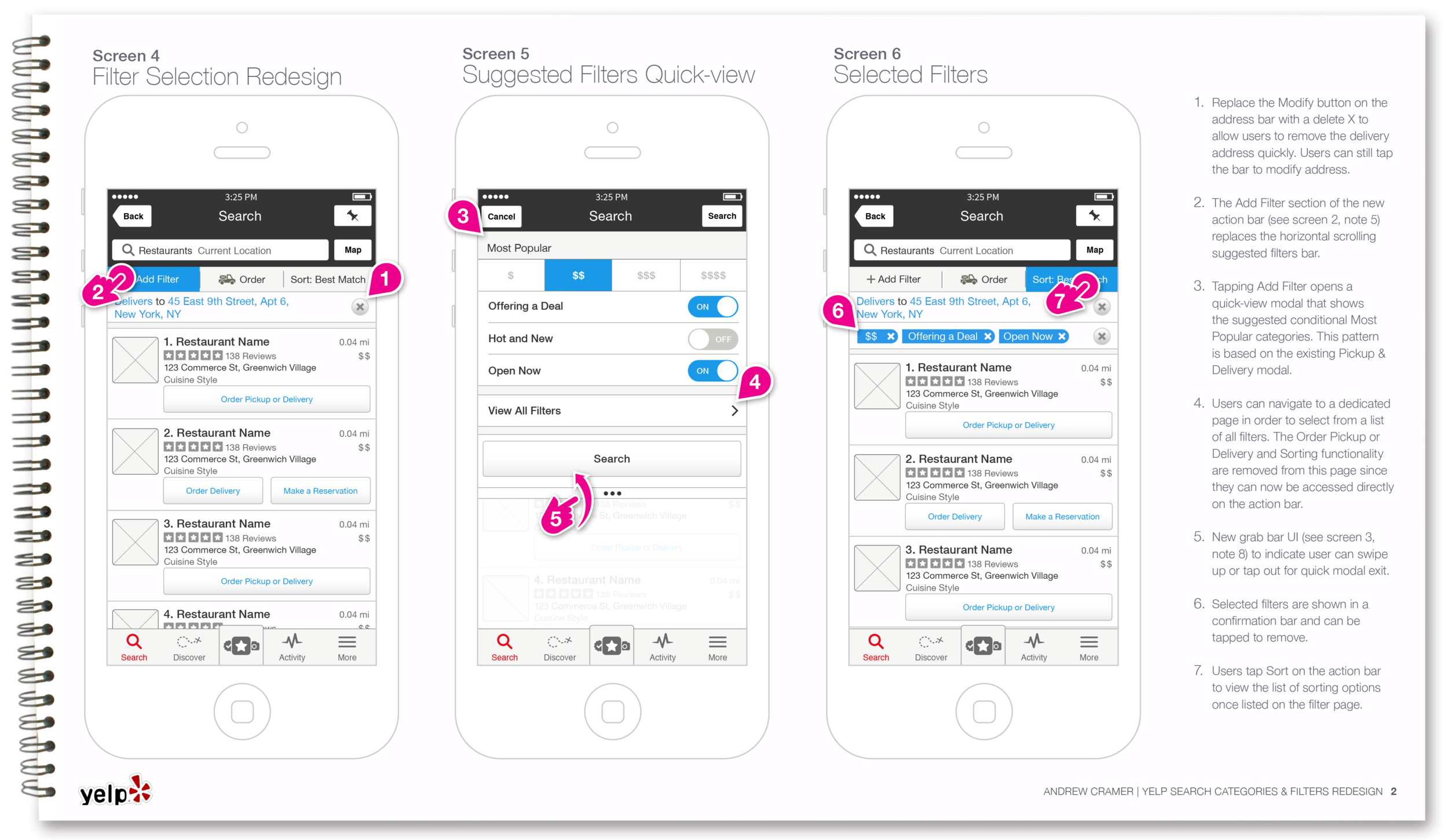
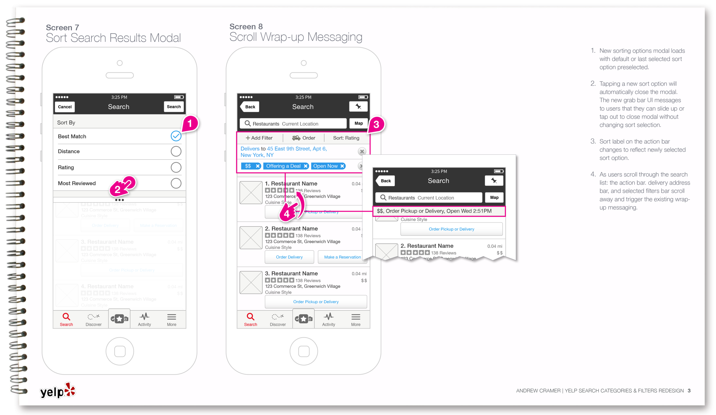
Wireframed new workflow articulating information architecture and new UI interactions.
UX Audit of Current Categories & Filters Experience
Workflow Diagram
UI Sketches
Based on my UX audit findings, I sketched a new framework to engage users with visual call to actions and encourage exploration of browse categories.


